Some people understand complex information best when it’s presented visually, such as as a chart or diagram, while others find that reading the information suits them better.
It’s quite difficult to please everyone, because, as you know, how many people so many opinions ☝️
But we decided not to give up and tried to please everyone! 😉
📍Today we will talk about the Charts📉 that you can find in our application on the Statistics tab.
So, you can build graphs for the selected parameter that your device sends and see general information about the state of this parameter.
Moreover, on the graph itself you can also find more detailed information about the selected parameter
And now let’s go into more detail❗
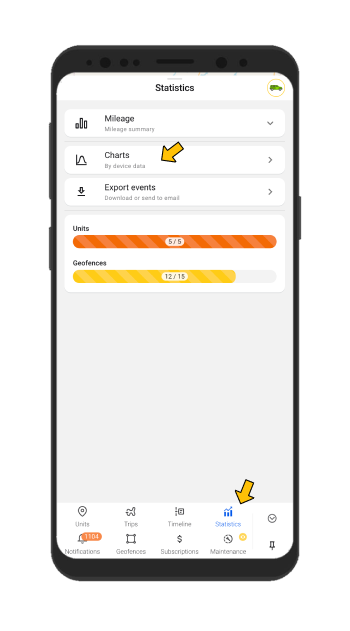
So, as we have already written, you can find Charts by going to the Statistics tab. Here you will see the Charts section - click on it.
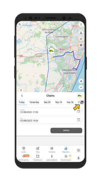
Select the period for which you would like to receive information. You can click on the Calendar icon and create no more than a week period.
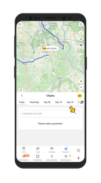
In the Parameter for Chart field, you will see the parameters that your tracker has sent for the entire time, so you can build a graph based on any parameter from the list.
If your device sent the selected parameter during the selected time period, then you will see general information:
- Start value
- Last value
- Minimum value
- Maximum value
- Average value
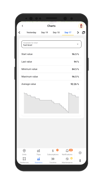
At the bottom of the list of general information about the parameter, you will find a preview of the graph. By clicking on it, the chart will open.
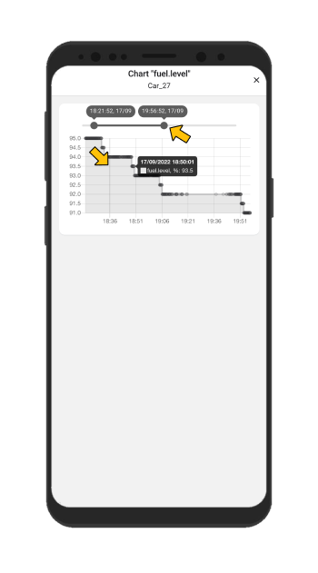
Here you can configure any time interval🕔, the graph display will change simultaneously with the changes in the time interval.
Messages that were sent with the selected parameters are displayed as ‘dots’ on the graph.
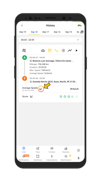
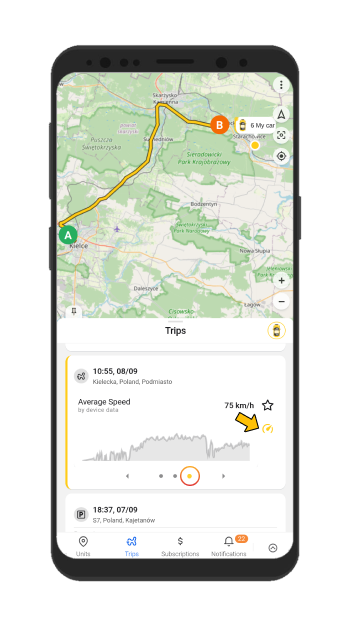
☝️It is necessary to point out that you can find the Speed chart in the History of the unit and by going to the Trips tab
📊Create charts and get information about your vehicle as you like!😉